Foundry (Item Selection)
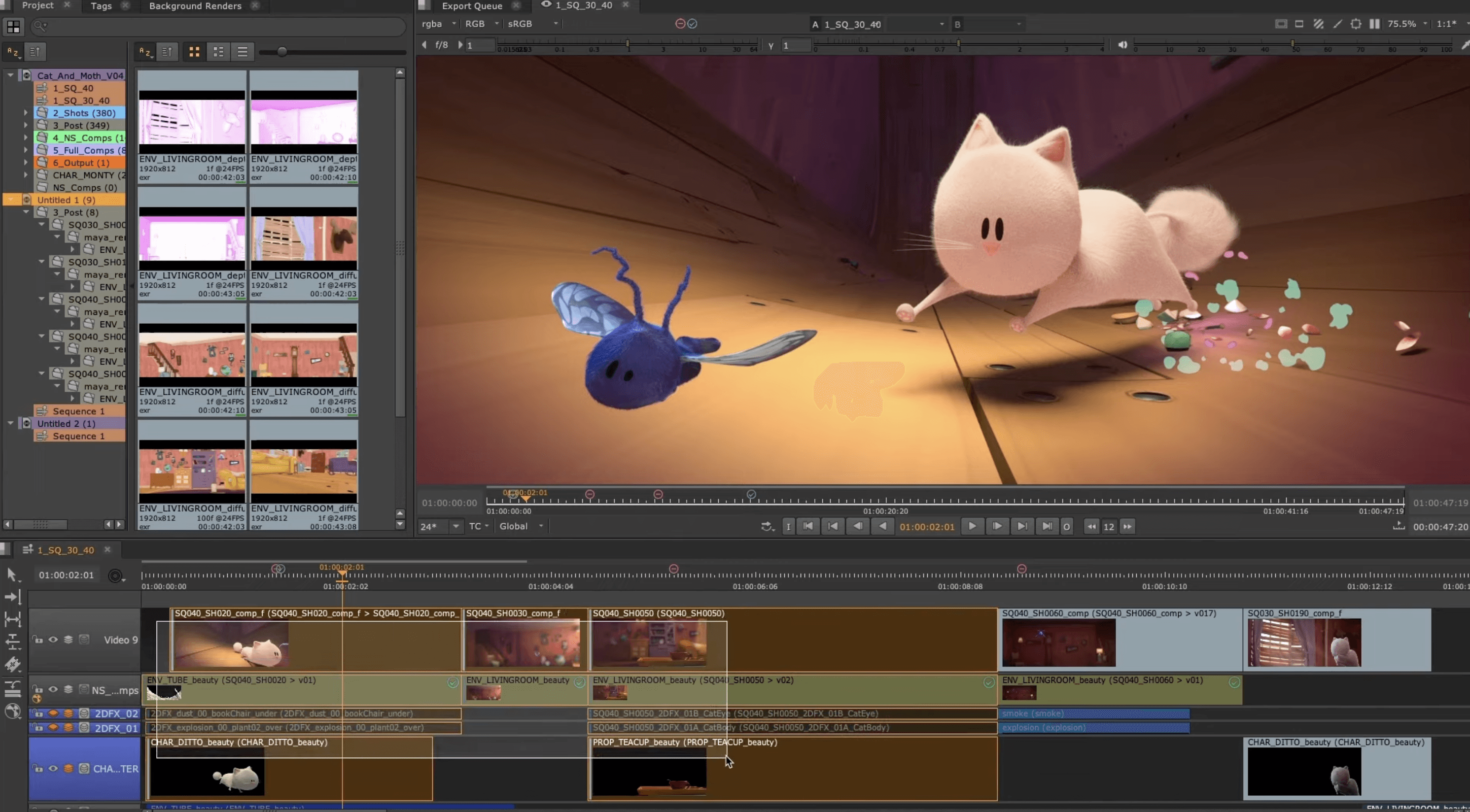
Redesigning the most frequently used functionality in Nuke Studio, the item selection.
Desktop App
Product Designer
7 weeks
Desktop App
UX Designer
4 Weeks
Foundry (Item Selection)
Redesigning the most frequently used functionality in Nuke Studio, the item selection.
Desktop App
Product Designer
7 weeks
Desktop App
UX Designer
4 Weeks

Foundry (Item Selection)
Redesigning the most frequently used functionality in Nuke Studio, the item selection.
Desktop App
Product Designer
7 weeks
Desktop App
UX Designer
4 Weeks

OVERVIEW SECTION
Key Concepts
Challenge
Redesigning the track item selection in Foundry Nuke Studio modernized the UI and rectified long-standing issues, enhancing the overall user experience in a critical area of the software—the timeline.
Impact
The UI revamp clarified timeline selection, boosting user efficiency and speed. New features like clone highlighting also enabled previously impossible workflows.
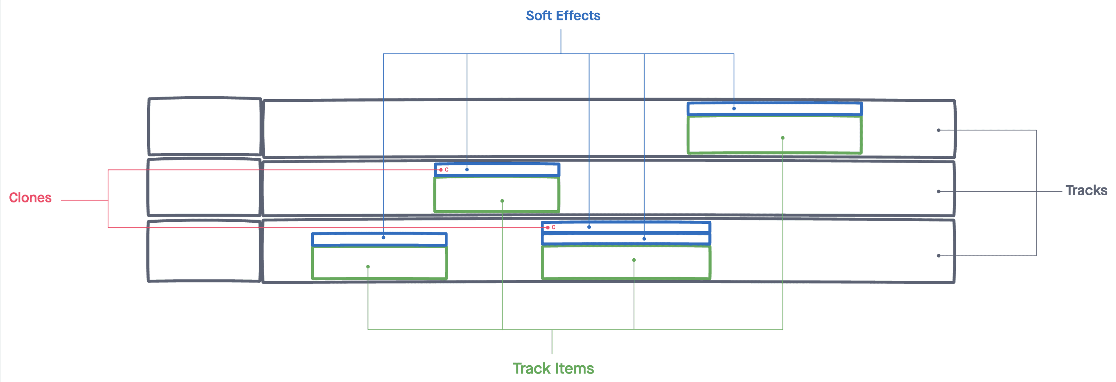
Useful terminology:
Tracks
Section of the timeline that contains video clips.
Track Items
The way video clips are called in Nuke Studio.
Soft Effects
Visual effects (eg. color correction) applied to a Track Item that modify it.
Clones
Linked Soft Effects enable synchronized updates across multiple elements.
Playhead
It indicates the frame currently displayed in the viewer.
OVERVIEW SECTION
Key Concepts
Challenge
Redesigning the track item selection in Foundry Nuke Studio modernized the UI and rectified long-standing issues, enhancing the overall user experience in a critical area of the software—the timeline.
Impact
The UI revamp clarified timeline selection, boosting user efficiency and speed. New features like clone highlighting also enabled previously impossible workflows.

Useful terminology:
Tracks
Section of the timeline that contains video clips.
Track Items
The way video clips are called in Nuke Studio.
Soft Effects
Visual effects (eg. color correction) applied to a Track Item that modify it.
Clones
Linked Soft Effects enable synchronized updates across multiple elements.
Playhead
It indicates the frame currently displayed in the viewer.
OVERVIEW SECTION
Key Concepts
Challenge
Redesigning the track item selection in Foundry Nuke Studio modernized the UI and rectified long-standing issues, enhancing the overall user experience in a critical area of the software—the timeline.
Impact
The UI revamp clarified timeline selection, boosting user efficiency and speed. New features like clone highlighting also enabled previously impossible workflows.

Useful terminology:
Tracks
Section of the timeline that contains video clips.
Track Items
The way video clips are called in Nuke Studio.
Soft Effects
Visual effects (eg. color correction) applied to a Track Item that modify it.
Clones
Linked Soft Effects enable synchronized updates across multiple elements.
Playhead
It indicates the frame currently displayed in the viewer.
discovery SECTION
Problems
Imprecise
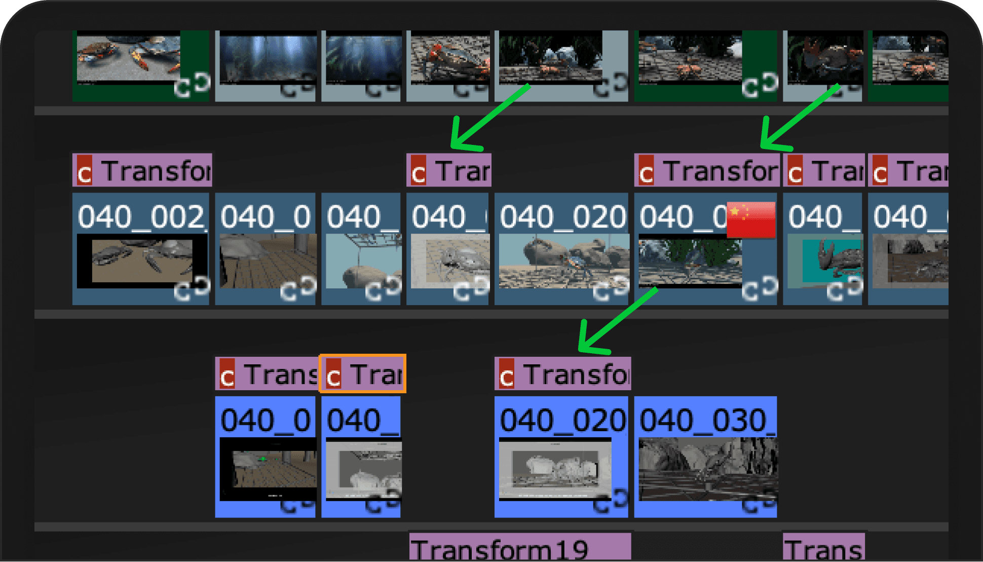
The UI's original infrastructure wasn't designed to accommodate new features, leading to inconsistencies like varying border thickness, missing highlight lines, and overflowing edges on soft effects.


Confusing
Users created tickets reporting that they found confusing to understand whether soft effects were selected or not, especially when looking from far away (zoomed out).

Ambiguos
When the full name of soft effects is hidden, it is impossible to distinguish which is clone of which.
discovery SECTION
Problems
Imprecise
The UI's original infrastructure wasn't designed to accommodate new features, leading to inconsistencies like varying border thickness, missing highlight lines, and overflowing edges on soft effects.


Confusing
Users created tickets reporting that they found confusing to understand whether soft effects were selected or not, especially when looking from far away (zoomed out).

Ambiguos
When the full name of soft effects is hidden, it is impossible to distinguish which is clone of which.

discovery SECTION
Problems
Imprecise
The UI's original infrastructure wasn't designed to accommodate new features, leading to inconsistencies like varying border thickness, missing highlight lines, and overflowing edges on soft effects.


Confusing
Users created tickets reporting that they found confusing to understand whether soft effects were selected or not, especially when looking from far away (zoomed out).

Ambiguos
When the full name of soft effects is hidden, it is impossible to distinguish which is clone of which.

analysis SECTION
Opportunity
How might we make the Track Item selection
accurate, clear and informative?
I converted our key problems into opportunities to solve during the redesign.
Imprecise
Accurate
Track items and soft effects must be precisely aligned, featuring symmetrical margins and borders.
All lines should display correctly.
Confusing
Clear
Users should instantly discern which track items and soft effects are selected, while still recognizing their original colors.
Ambitious
Informative
Highlight clones on the timeline for quick recognition when a soft effect is selected.
Possible impact
If we could create a UI more Accurate, Clear and Informative, users would be able to work quicker and more efficiently, have total control over the timeline and avoid wasting time in tedious and repetitive actions.
brainstorming SECTION
Design Iterations
Iterated on UI design to unify track items and soft effects visually, aiding quick color recognition and improving overall user experience.
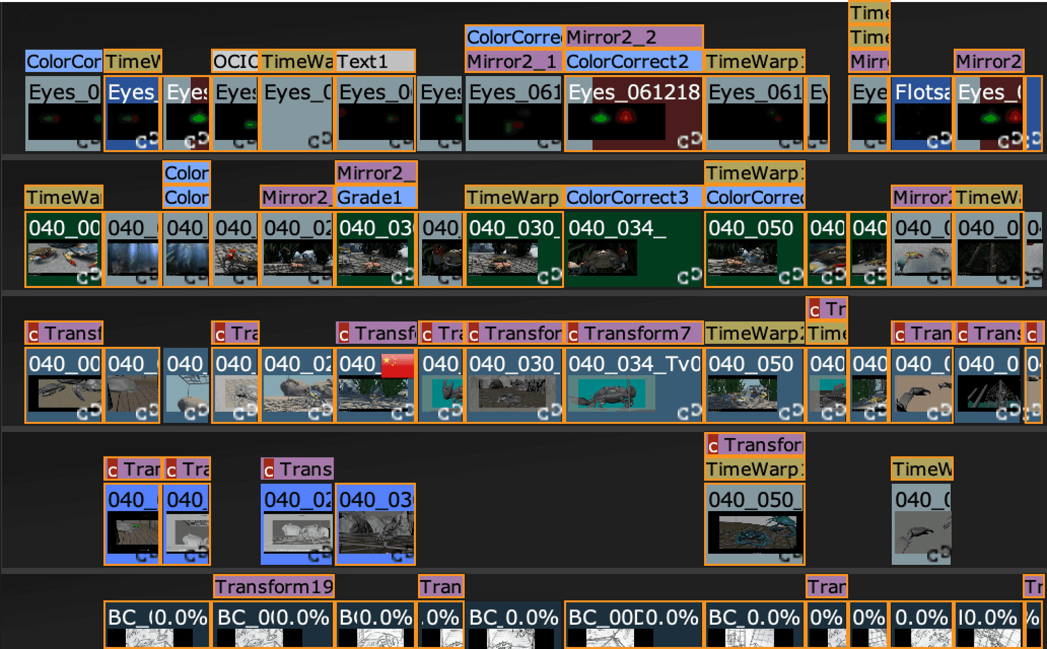
Initial design tested poorly for item selection clarity, especially at low zoom levels. Despite good color readability, we opted to discard it.
brainstorming SECTION
Design Iterations
Iterated on UI design to unify track items and soft effects visually, aiding quick color recognition and improving overall user experience.

Initial design tested poorly for item selection clarity, especially at low zoom levels. Despite good color readability, we opted to discard it.
brainstorming SECTION
Design Iterations
Iterated on UI design to unify track items and soft effects visually, aiding quick color recognition and improving overall user experience.

Initial design tested poorly for item selection clarity, especially at low zoom levels. Despite good color readability, we opted to discard it.
delivery SECTION
Solution
The new UI is cleaner, modern, and successfully integrated into the latest software release.
Accurate
The new UI has uniform one-pixel gaps between track items, eliminating undesired gaps and double edges.
Increased padding enhances readability, resulting in a cleaner and tidier interface.
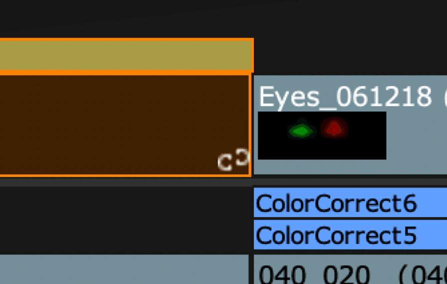
Before
When selected, track items change color, but soft effects don't, causing confusion at low zoom levels about what's actually selected.
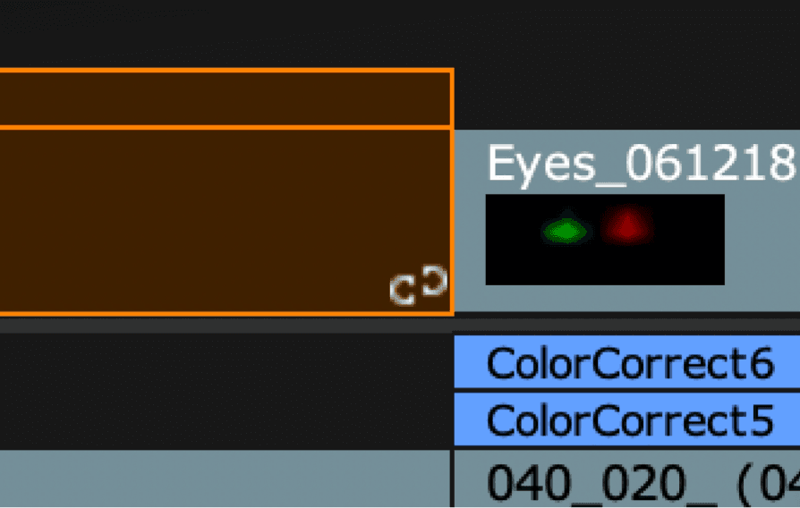
After
Color consistency achieved for selected soft effects and track items; eliminated unwanted gaps and offsets for a cleaner UI.
Before
After
Color consistency achieved for selected soft effects and track items; eliminated unwanted gaps and offsets for a cleaner UI.

Clear
Quickly identify selected track items and soft effects. Added color strips maintain visibility of original colors, even when selected—enhancing clarity.
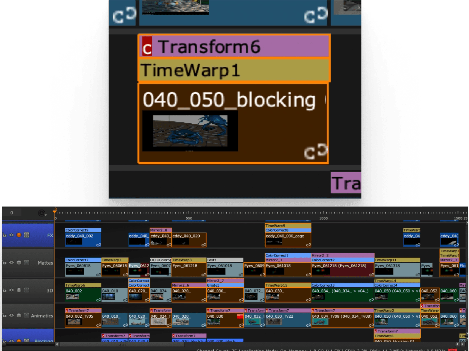
Before
When selected, track items change fill colour, while soft effects don't. This, especially at low level of zooms, make it confusing to discern what is selected and what not.
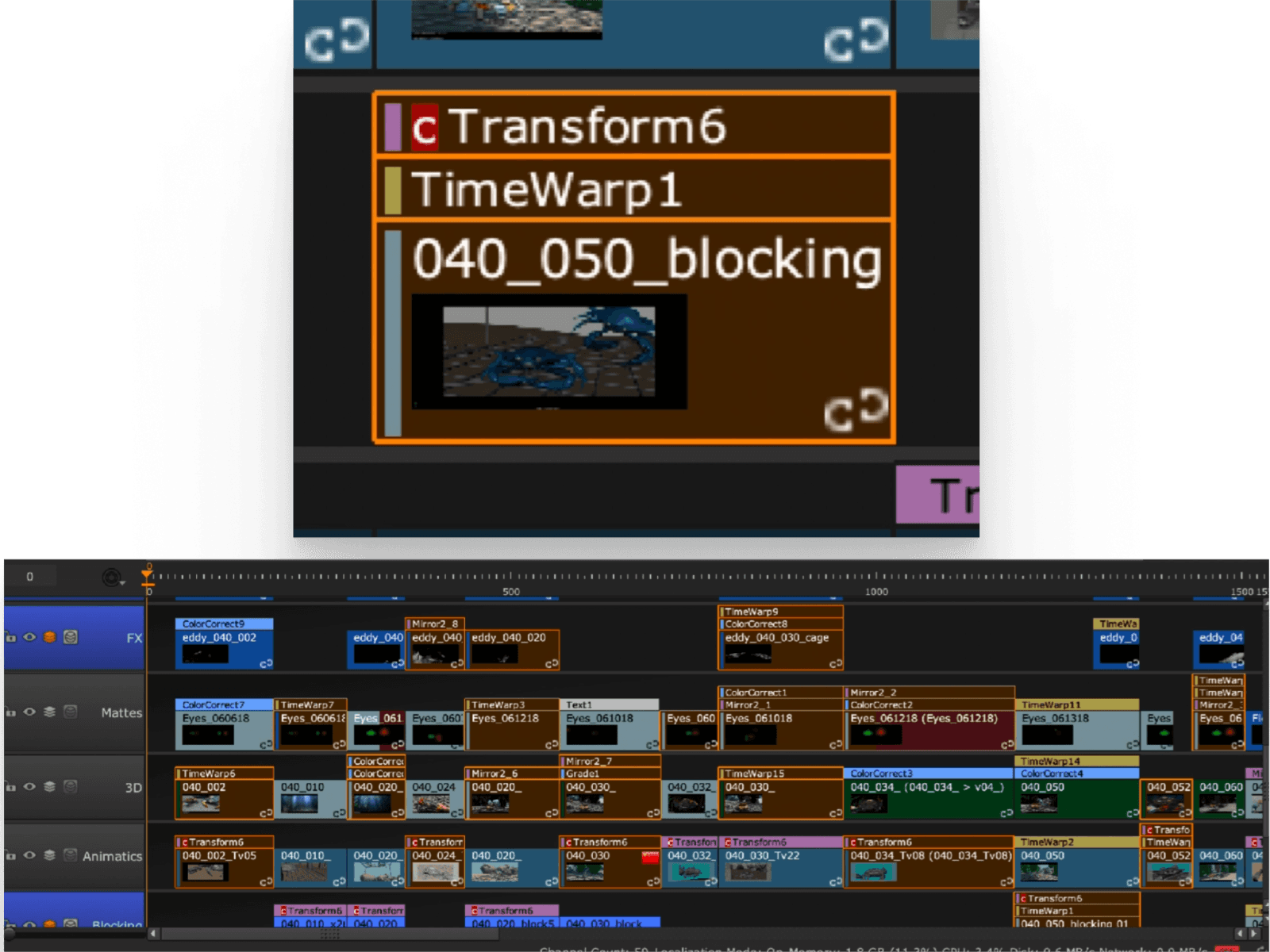
After
Selected track items and soft effects now change fill color for consistency.
Colorful tags within the selection retain type indicators, enhancing user clarity.
Before
After
Selected track items and soft effects now change fill color for consistency.
Colorful tags within the selection retain type indicators, enhancing user clarity.
Informative
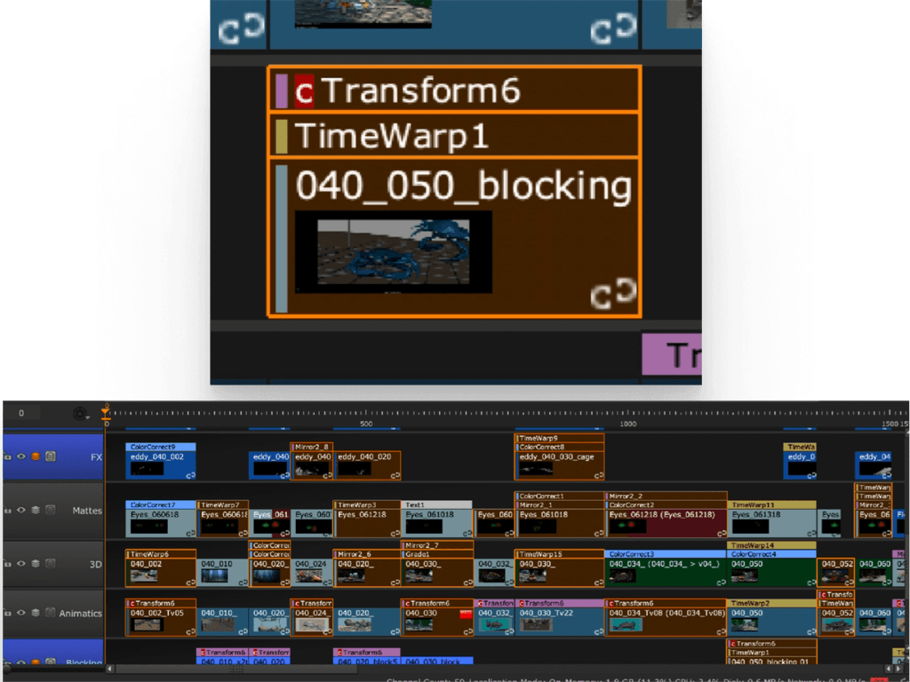
The redesign now highlights clones of a selected soft effect with an orange border, making it easy to distinguish between clones and non-clones, information that was previously unclear.
Before
The UI doesn't provide an indication of which are the clones of a specific soft effect. All clones have the "C" tag, which doesn't help differentiate clones of different soft effects.

After
Clones of the same soft effect are now highlighted, so it's clear which soft effect is a clone of what.

Before
After
The UI doesn't provide an indication of which are the clones of a specific soft effect. All clones have the "C" tag, which doesn't help differentiate clones of different soft effects.

delivery SECTION
Solution
The new UI is cleaner, modern, and successfully integrated into the latest software release.
Accurate
The new UI has uniform one-pixel gaps between track items, eliminating undesired gaps and double edges.
Increased padding enhances readability, resulting in a cleaner and tidier interface.
Before
When selected, track items change color, but soft effects don't, causing confusion at low zoom levels about what's actually selected.

After
Color consistency achieved for selected soft effects and track items; eliminated unwanted gaps and offsets for a cleaner UI.

Before
After
Color consistency achieved for selected soft effects and track items; eliminated unwanted gaps and offsets for a cleaner UI.

Clear
Quickly identify selected track items and soft effects. Added color strips maintain visibility of original colors, even when selected—enhancing clarity.
Before
When selected, track items change fill colour, while soft effects don't. This, especially at low level of zooms, make it confusing to discern what is selected and what not.

After
Selected track items and soft effects now change fill color for consistency.
Colorful tags within the selection retain type indicators, enhancing user clarity.

Before
After
Selected track items and soft effects now change fill color for consistency.
Colorful tags within the selection retain type indicators, enhancing user clarity.

Informative
The redesign now highlights clones of a selected soft effect with an orange border, making it easy to distinguish between clones and non-clones, information that was previously unclear.
Before
The UI doesn't provide an indication of which are the clones of a specific soft effect. All clones have the "C" tag, which doesn't help differentiate clones of different soft effects.

After
Clones of the same soft effect are now highlighted, so it's clear which soft effect is a clone of what.

Before
After
The UI doesn't provide an indication of which are the clones of a specific soft effect. All clones have the "C" tag, which doesn't help differentiate clones of different soft effects.

delivery SECTION
Solution
The new UI is cleaner, modern, and successfully integrated into the latest software release.
Accurate
The new UI has uniform one-pixel gaps between track items, eliminating undesired gaps and double edges.
Increased padding enhances readability, resulting in a cleaner and tidier interface.
Before
When selected, track items change color, but soft effects don't, causing confusion at low zoom levels about what's actually selected.

After
Color consistency achieved for selected soft effects and track items; eliminated unwanted gaps and offsets for a cleaner UI.

Before
After
Color consistency achieved for selected soft effects and track items; eliminated unwanted gaps and offsets for a cleaner UI.

Clear
Quickly identify selected track items and soft effects. Added color strips maintain visibility of original colors, even when selected—enhancing clarity.
Before
When selected, track items change fill colour, while soft effects don't. This, especially at low level of zooms, make it confusing to discern what is selected and what not.

After
Selected track items and soft effects now change fill color for consistency.
Colorful tags within the selection retain type indicators, enhancing user clarity.

Before
After
Selected track items and soft effects now change fill color for consistency.
Colorful tags within the selection retain type indicators, enhancing user clarity.

Informative
The redesign now highlights clones of a selected soft effect with an orange border, making it easy to distinguish between clones and non-clones, information that was previously unclear.
Before
The UI doesn't provide an indication of which are the clones of a specific soft effect. All clones have the "C" tag, which doesn't help differentiate clones of different soft effects.

After
Clones of the same soft effect are now highlighted, so it's clear which soft effect is a clone of what.

Before
After
The UI doesn't provide an indication of which are the clones of a specific soft effect. All clones have the "C" tag, which doesn't help differentiate clones of different soft effects.

final SECTION
Conclusion
This project showcased Foundry's focus on pairing powerful software with a great user experience. My role was to tackle this challenge, starting with a more cohesive UI.
The latest release featuring this work boosts user efficiency significantly. When operations are repeated daily, even small improvements translate into big gains in speed and productivity.
Takeaways
Re-purposing
Reusing existing UI elements sped up design and implementation. It also aided user familiarity. New elements aren't always better.
1
Details, not at all costs
Minor alignment issues are visible on high-res screens when zoomed in. It looked fine otherwise, so we chose not to fix it.
2
Usability and Interactions
Enhancing visual communication improved both aesthetics and usability. The result was both pretty and functional.
3
More case studies
This case study
FOUNDRY (Item Selection)
Redesigning the most frequently used functionality in Nuke Studio, the item selection.
Back to Top
Next case study
USFL
Redefining what it means to be a Football Fan.
Read case study
More case studies
This case study
FOUNDRY (Item Selection)
Redesigning the most frequently used functionality in Nuke Studio, the item selection.
Back to Top
Next case study
USFL
Redefining what it means to be a Football Fan.
Read case study
More case studies
This case study
FOUNDRY (Item Selection)
Redesigning the most frequently used functionality in Nuke Studio, the item selection.
Back to Top
Next case study
USFL
Redefining what it means to be a Football Fan.
Read case study
Promise you that I’ll reply back within 24 hours.
Promise you that I’ll reply back within 24 hours.
Promise you that I’ll reply back within 24 hours.
© 2023 Giuseppe Laterza. All rights reserved.
© 2023 Giuseppe Laterza. All rights reserved.
© 2023 Giuseppe Laterza. All rights reserved.